How does PowerPoint use theme colours?
Ever wondered why when you insert a rectangle, draw a line or insert a chart on a PowerPoint slide, it has a particular default colour? Microsoft PowerPoint automatically assigns these colours using a set of Theme Colors. Theme colours is a topic that support.microsoft.com doesn’t explain (or explains poorly). This article explains the little-known aspects of theme colours in PowerPoint and shows you how to create a custom theme colour in PowerPoint. This blog is part of a blog series of beautiful colour schemes for PowerPoint slide designs.
Why Theme Colors are important in PowerPoint
Setting up theme colours correctly is important because your colour choices affect the appearance of everything in a PowerPoint slide.
If you’re working with a specific colour scheme such as corporate identity, you may want to incorporate them into your PowerPoint template. Or you are working with a template and wonder how you can improve the colours scheme on your slides. You’re not alone because this theme colour issue is a common one. Knowing how to work with theme colours in PowerPoint is the answer.
Understand how Theme Colors work in PowerPoint
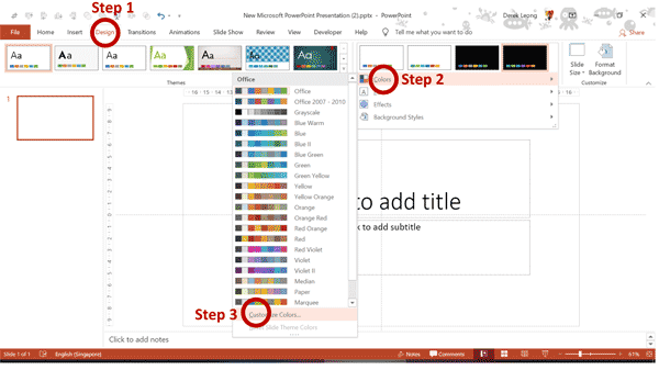
Let’s look at your current theme colours by clicking on Design Ribbon->Variants Group->Colors->Customize Colors (see figure 1).
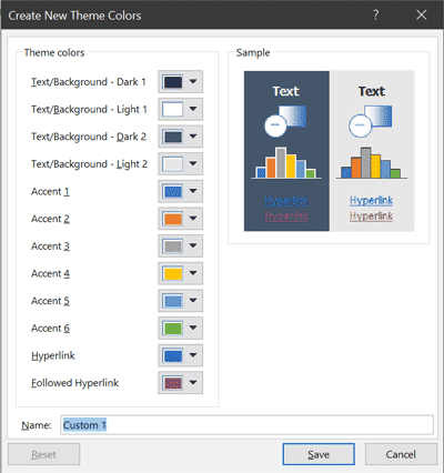
In the Theme Colours dialog box, you will see 12 default theme colours. These include two light, two dark, six accents, hyperlink, and followed hyperlink colours (see figure 2).
Each of these theme colours defines how PowerPoint sets the colour of each type of graphic object you insert on a slide. Not only do the colours influence background styles and placeholder text, but theme colours also populate all the style galleries as well.
When you understand how these 12-theme colours work together, you will be able to create beautiful colour schemes in PowerPoint.
The Text/Background Colours
The first four theme colour are designated as Text/Background – Dark 1, Light 1, Dark 2, and Light 2. These colours work together to ensure that your text is visible, no matter whether your background is light or dark.
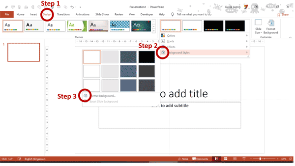
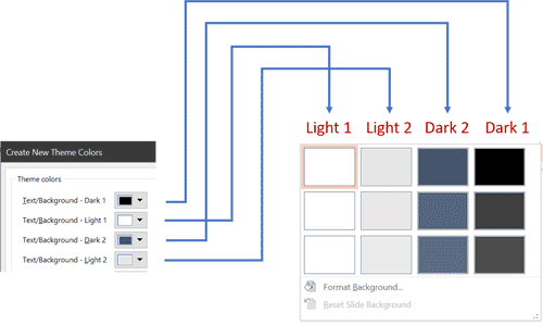
- You can choose a default background colour. You can choose any of these 4 colours as the default background colours of all your slides in a PowerPoint. Click Design Ribbon->Variants Group->Background Styles (see figure 3). By default, Light 1 will be the default background style if you do not set a background style.
- Background styles are based on the four Text/Background – Dark 1, Light 1, Dark 2, and Light 2 theme colours (see Figure 4).
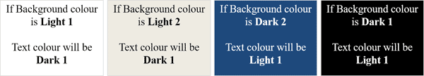
- Text colour in PowerPoint always defaults to either Dark 1 or Light 1, whichever is the opposite value from the value you chose for the background style. For instance, if you select a background style with Dark 1 or Dark 2 colour, the default text colour is Light 1. Choose a background style with Light 1 or Light 2 colour, and the default text colour is Dark 1. You can see the various background and text colour combinations in figure 5.
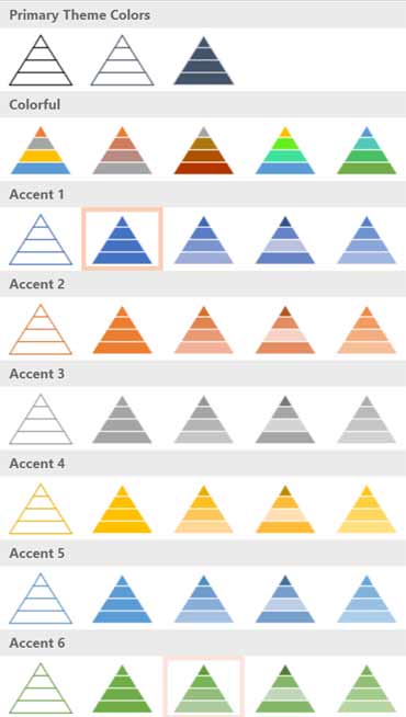
The Six Accent Colors
The six accent colours form the basic palette for your presentation graphics. It’s important that all accent colours stand apart from the background colours and that they look harmonious as a group.
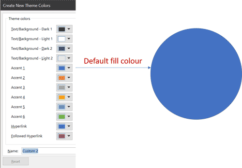
- Accent 1 is the default fill colour when you draw lines and shapes. The outline colour will be a darker version of Accent 1 (see figure 6).
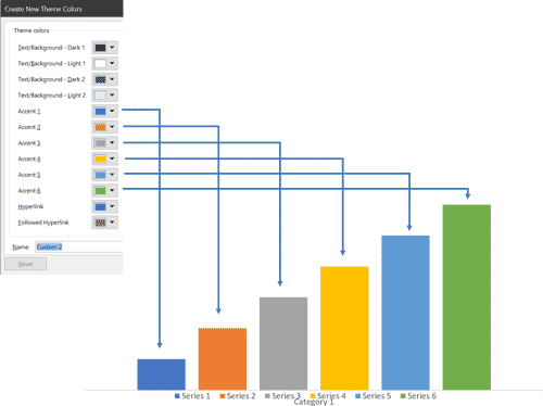
- Charts populate with these six accent colours in order (see Figure 7). When determining the order of accent colours, consider how they will look next to one another in a column or bar chart.
- SmartArt graphics also use the colours from the six Accent colours, although a small caveat is the “Colorful” SmartArt begins with Accent 2 in most SmartArt diagrams (see Figure 8).
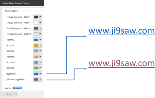
Hyperlink and Followed Hyperlink Colours
The Hyperlink colour applies only to text with a defined hyperlink. The Followed Hyperlink colour displays only in Slide Show mode after a hyperlink has been clicked (see figure 9).
How to create Theme Colours from scratch in PowerPoint
If the current colour themes don’t quite work for your template or if you are creating a corporate template, and you would like the accent colours to be derived from a branding colour palette, then you must create a custom colour theme. To do so, follow these steps:
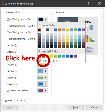
Step 1: Click on Design Ribbon->Variants Group->Colors->Customize Colors (see figure 10).
Step 2: To edit each theme colour, click the colour swatch to open the Theme Colors gallery and then click More Colors (see Figure 11).
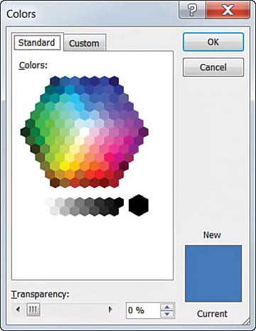
Step 3: The Standard tab in the Colors dialog box displays a honeycomb of basic colours (see Figure 12).
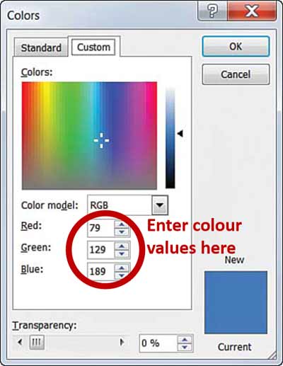
Step 4: Switch to the Custom tab to have access to 16 million colours. At the bottom of the Custom window, you can enter values for Red, Green and Blue colours (see Figure 13).
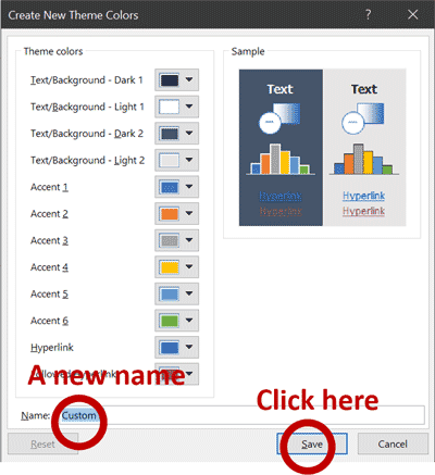
Last Step: Give this colour scheme a name, such as “Custom 1“, and click Save. The new theme colours are applied to your current PowerPoint file (see Figure 14).
About Ji9saw Design
Ji9saw is the premier PowerPoint Design agency in Singapore. We help C-suite executives and business leaders craft, design and deliver vibrant PowerPoint presentations for any event. We also teach a PowerPoint Design masterclass in Singapore.
Ji9saw is now on Instagram!
So take a look and follow us on www.instagram.com/ji9sawdesign.