What are Infographic Timelines
A timeline is a graphical representation of a period of time which marks important events. It illustrates how one event leads to another, and this in turn helps viewers understand chronological stories quickly. It is an excellent format to present historical accounts of war records, ancient civilizations, royal families, biographies and so forth.
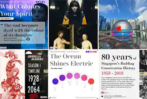
Remaking a Timeline from the Urban Redevelopment Authority (URA)
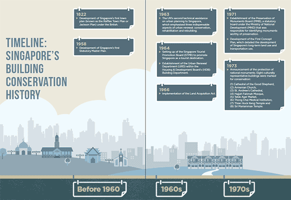
This is a timeline account of Singapore’s urban planning history starting from 1822. Point noted that the original timeline is not particularly ugly, but it has the typical problems of graphical timelines:
- Weak cause and effect narrative
Timeline designers tend to state an event but do not bother to explain the effect or significance of an event. This can create a bad timeline that looks like a series of random events cobbled together with no overall storyline. - Example of weak timeline narrative
To illustrate the above, this timeline starts in 1822 with the event narrative “Development of Singapore’s first town plan under the British”. The next event abruptly jumps to 1958 that says “Development of Singapore’s first Statutory Master Plan.” without providing any context to this passing of 137 years. - A better narrative
We can improve the timeline by writing the 1822 event as “Development of Singapore’s first town plan under the British. For the next 137 years, nothing further was done“. This allows the reader to better understand the significance of the 1958 event. - Does not show the passing of time well
Timeline show passing of time by using numbers on a line. It can look sterile. This timeline spans about 200 hundred years. It’s a long time and to the casual viewer, it is difficult to imagine the significance of this long span of history.
How to Design Better Infographic Timelines
- Tell a good story
Take the effort to “explain” an event instead of just “stating” an event. The difference between the two can be just adding a few more words to explain the significance of an event. - Show cause and effect in a timeline
The best timelines tell an epic cause and effect story. Improve each event’s narrative by writing it as a “cause” to the next event. You are guiding the reader along the timeline by writing a clear sequence of cause and effect events. - Bring the viewer into the time period
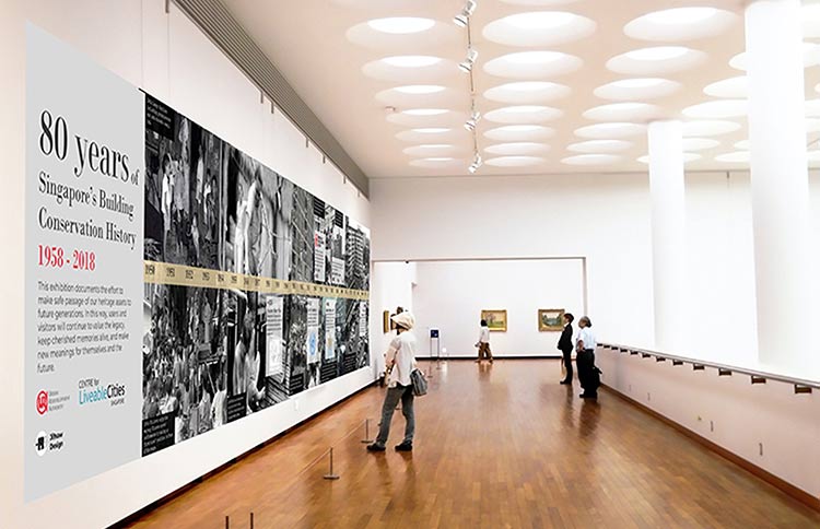
In a typical timeline, we often see a chain of events placed on a sterile background. You could use historical pictures as a backdrop to the relevant time of an event to bring a viewer into the time period make it more experiential. - Make the viewer feel the passing of time
If it is possible, use animation to move the timeline, or even better, expand the timeline and install it along a walkway!
About Ji9saw Design
Ji9saw Design is a digital creative agency in Singapore. We design and develop compelling infographics to engage your audience. We also teach an infographics design masterclass.
Ji9saw is now on Instagram!
So take a look and follow us on www.instagram.com/ji9sawdesign.